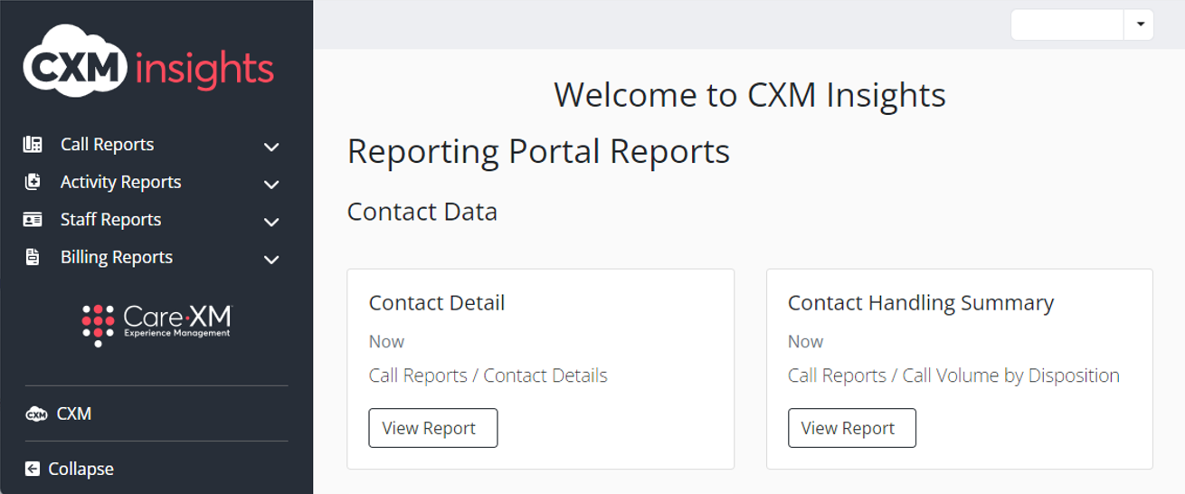
To access Insights, go to https://insights.carexm.com
You will use the same login information that you use to access CXM to log into Insights. This means that if you change your CXM password, it will update in Insights as well.
Your CXM user must have the Analytics toggle turned ON in order to log into Insights.
Once logged in, you will be on the landing page and can choose from the different reports by hovering over the category in the left side bar:
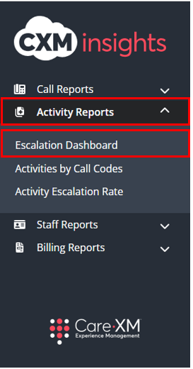
Choose "Activity Reports", then "Escalation Dashboard".
The Escalation Dashboard provides clarity into how often and why Activities are being escalated to client staff.
For purposes of this dashboard, an Activity is considered 'Escalated' if it has at least one follow-up note that is contacting a client staff member whether that is a call, secure message, or task. These will be referred to as 'Escalated Activities' throughout the dashboard.
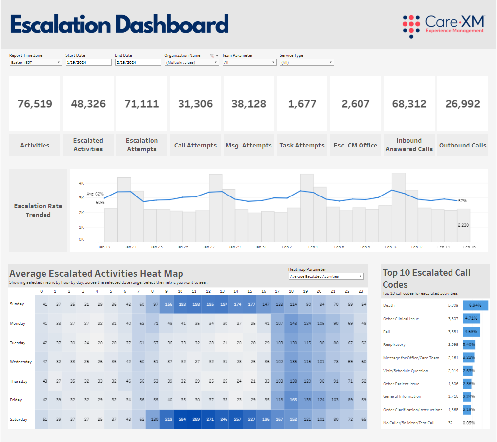
This report can be filtered by Report Time Zone, Start Date, End Date, Organization Name, Team Parameter, Service Type, and Organization State.
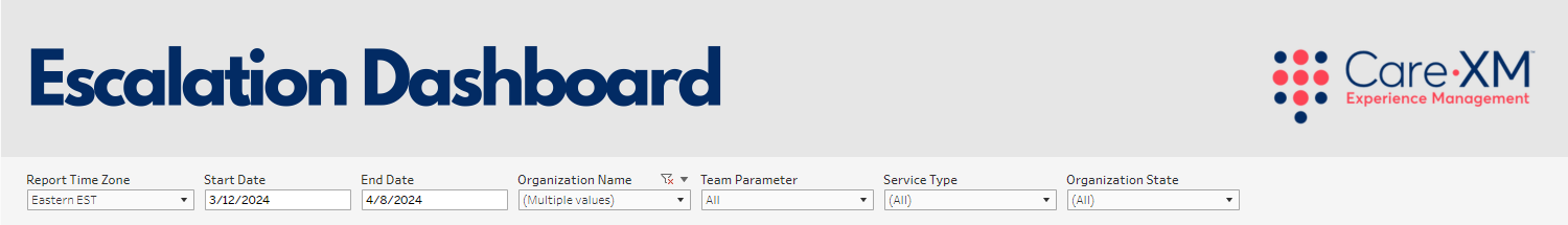
- Report Time Zone - This filter will set the time zone of all activities and calls shown on the dashboard to the selected time zone. This filter defaults to EST.
- Start Date / End Date - These filters allow the user to set the date range for the data shown within the dashboard. The date range is set to the last 28 days by default.
- Note: It is recommended to always select full week dates to create a full picture within the heat map.
- Organization Name - This filter allows the user to select the organization(s) for which they want to see data. Only Organization(s) that the user has access to AND that have data in the selected time frame will be shown in the filter options.
- Team Parameter - This filter allows the user to see only what was created by a specific team. For example, if filtered down to CareTriage, the dashboard would only show Activities and Follow-up Notes that were created by CareTriage and Call counts that were handled by CareTriage.
- By default, this filter will include all Teams selected.
- Note: This filter does not have a multi-select option. Users can view items created by ‘All’ teams by default, or select an individual team to view.
- The available options shown will be only those relevant to the Organization(s) selected.
- Team Definitions:
- CareAssist - The CXM Non-Clinical Team
- CareTriage - The CXM Clinical Team
- CXM App - The Total Triage Mobile app calls
- CXM - The client Enterprise team
- By default, this filter will include all Teams selected.
- Service Type - This filter allows the user to filter down to activities tied to patients of a specific service type.
- The available options shown will be only those relevant to the patients of the selected organization(s) who had activities within the selected time frame.
- Note: This filter does NOT apply to the Inbound Answered Calls or Outbound Calls tiles.
- Organization State - This filter allows users to filter the list of Organizations down to those located in the selected geographical state(s). By default, all Organization States will be selected.
Note: For report to filter correctly, click on the "Apply" button on the bottom of each filter's drop down. Only applies if the list exceeds 10 options.
The top section shows the Tiles where you can find the total of Activities, Escalated Activities, Escalation Attempts, Call Attempts, Message Attempts, Task Attempts, Escalated CM Office, Inbound Answered Calls, and Outbound Calls.
Note: You can hover over each tile for more details on the total counts.
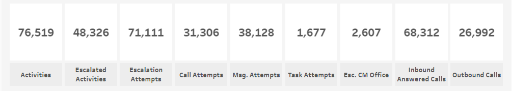
- Activities - Total count of activities within the dashboard.
- On-hover - This shows a trendline day over day of the daily activity counts for the selected time period. There are labels at the beginning and end of the line to give context as to the daily count. The trendline itself is in blue with a light grey dashed line that shows the overall direction of the trend.
- Escalated Activities - Total count of Escalated Activities: Any activity with at least one contact attempt (Call, Message, or Task) to Client Staff.
- On-hover - This shows the percentage of Escalated Activities along with a trend line that shows the total count of escalated activities broken down by day.
- Calculation - Count of Escalated Activities divided by the Count of Created Activities
- On-hover - This shows the percentage of Escalated Activities along with a trend line that shows the total count of escalated activities broken down by day.
- Escalation Attempts- Total count of follow up notes flagged as an escalation. Escalations are those follow-up notes that were made to client staff. This includes Calls that have a type of 'Client Staff - Outbound', Secure Messages (not reminders), and Tasks.
- On-hover - This shows a trendline day over day of the total daily count of escalation attempts for the selected time period. There are labels at the beginning and end of the line to give context as to the daily count. The trendline itself is in blue with a light grey dashed line that shows the overall direction of the trend.
- The on-hover also includes:
- Escalation Attempt # -This is the number of follow-up attempts that were escalations.
- Escalation attempts per Escalated Activity - This is the total escalation attempts divided by the total number of escalated activities. This number can be used to assess how many attempts it takes before an escalation is accepted.
- The on-hover also includes:
- On-hover - This shows a trendline day over day of the total daily count of escalation attempts for the selected time period. There are labels at the beginning and end of the line to give context as to the daily count. The trendline itself is in blue with a light grey dashed line that shows the overall direction of the trend.
- Call Attempts - This is the total count of Follow-up notes with the type of 'Client Staff - Outbound'
- On-hover - This shows a trendline day over day of the total daily count of Client Staff - Outbound call escalation attempts for the selected time period. There are labels at the beginning and end of the line to give context as to the daily count. The trendline itself is in blue with a light grey dashed line that shows the overall direction of the trend.
- The on-hover also includes:
- Call Attempts # - This is the number of escalation attempts of the type 'Client Staff - Outbound'.
- Avg. Call Attempts per Activity - This is the average number of call attempts per activity. This number is found by dividing the number of Escalation Call Attempts by the number of escalated Activities.
- The on-hover also includes:
- On-hover - This shows a trendline day over day of the total daily count of Client Staff - Outbound call escalation attempts for the selected time period. There are labels at the beginning and end of the line to give context as to the daily count. The trendline itself is in blue with a light grey dashed line that shows the overall direction of the trend.
- Message Attempts - This is the total count of Secure Messages. Note: The Secure Message count does not include Reminders and is currently only available for the Total Triage Mobile app (Secure Message counts will be added for The MyTeleMed App in the future).
- On-hover - This shows a trendline day over day of the total daily count of Secure Message attempts for the selected time period. There are labels at the beginning and end of the line to give context as to the daily count. The trendline itself is in blue with a light grey dashed line that shows the overall direction of the trend.
- The on-hover also includes:
- Message Attempts # - This is the total count of Secure Messages Sent. This does not include reminders.
- Avg. Message Attempts per ESC Activity - This is the average number of Secure Messages sent per activity. This number is found by dividing the total number of escalated Secure Messages sent by the Total number of escalated Activities.
- The on-hover also includes:
- On-hover - This shows a trendline day over day of the total daily count of Secure Message attempts for the selected time period. There are labels at the beginning and end of the line to give context as to the daily count. The trendline itself is in blue with a light grey dashed line that shows the overall direction of the trend.
- Task Attempts - This is the total count of Tasks sent.
- On-hover - This shows a trendline day over day of the total daily count of Task attempts for the selected time period. There are labels at the beginning and end of the line to give context as to the daily count. The trendline itself is in blue with a light grey dashed line that shows the overall direction of the trend.
- The on-hover also includes:
- Task Attempts # - This is the total count of Tasks sent.
- Task Attempts per ESC Activity - This is the average number of Tasks sent per activity. This number is found by dividing the total number of escalated Secure Message and Tasks sent by the Total number of escalated Activities.
- The on-hover also includes:
- On-hover - This shows a trendline day over day of the total daily count of Task attempts for the selected time period. There are labels at the beginning and end of the line to give context as to the daily count. The trendline itself is in blue with a light grey dashed line that shows the overall direction of the trend.
- Escalated CM Office - This represents the count of activities where the CM/Office flag was checked and there was an escalation event.
- On-hover - This shows a trendline day over day of the total daily count of activities flagged as CM/Office for the selected time period. There are labels at the beginning and end of the line to give context as to the daily count. The trendline itself is in blue with a light grey dashed line that shows the overall direction of the trend.
- The on-hover also includes:
- CM Office Activities - Count of activities with CM/Office flagged.
- CM Office Activities % of Total Activities - Percentage of activities with CM/Office flagged.
- Escalated CM Office Activities - Count of activities where both CM/Office was flagged AND the activity was Escalated to client staff.
- Escalated CM Office Activities % of Total Activities - Percentage of activities where both CM/Office was flagged AND the activity was Escalated to client staff.
- The on-hover also includes:
- On-hover - This shows a trendline day over day of the total daily count of activities flagged as CM/Office for the selected time period. There are labels at the beginning and end of the line to give context as to the daily count. The trendline itself is in blue with a light grey dashed line that shows the overall direction of the trend.
- Inbound Answered Calls - This is the total count of Inbound Answered Calls. Inbound calls with a Disposition of Staff Answer, TT Nurse Answer, and UN Nurse Answer are included in this count. Inbound calls with a Disposition of IVR Abandon, Queue Abandon, Voicemail, or any Transfer are NOT included in this count. By default, this count includes calls answered by any Team. This can be adjusted by using the Team (Source System) filter. This count comes from the Contact Detail Dataset and is not tied directly to the activity count. It is expected that this number would be different than the total number of Activities as there is not a 1:1 relationship between calls and activities.
- On-hover - This shows a trendline day over day of the total daily count of Inbound Answered calls for the selected time period. There are labels at the beginning and end of the line to give context as to the daily count. The trendline itself is in blue with a light grey dashed line that shows the overall direction of the trend.
- Outbound Calls - This is the total count of Outbound calls. Similarly, to the Inbound Answered Calls, the Outbound Call count is not directly tied to Escalation attempts and will not match that number.
- On-hover - This shows a trendline day over day of the total daily count of outbound calls for the selected time period. There are labels at the beginning and end of the line to give context as to the daily count. The trendline itself is in blue with a light grey dashed line that shows the overall direction of the trend.
The Escalation Dashboard as whole includes escalation events created by CareAssist. The applicable tiles will now reflect counts for the following types of Follow-Up notes created by CareAssist users:
- Call Attempts:
- Client Staff – Outbound
- Contact Attempt: Patch
- Contact Attempt: Call – VM Notify
- Contact Attempt: Call – No VM
- Contact Attempt: Left Full Message
- Message Attempts:
- Contact Attempt: Send Mobile App Notification
- Message Sent
The middle section tile is the Escalation Rate Trended and it shows how Escalation Rate changes over time.
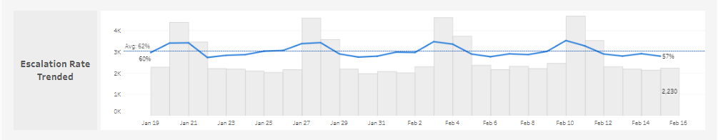
This tile shows a day to day trendline with the count of Activities Created shown as gray columns in the back and the Escalation Rate shown as a blue line. A daily average is shown as a blue dotted line.
- The on-hover shows the following information:
- Report Date - Date of column being hovered on.
- Escalated Activity Count - This is the number of activities that were escalated f.
- Total Activity Count - This is the total count of activities created.
- Escalation Rate - This is the percentage of activities that were escalated. This is found by dividing the Escalated Activity Count by the Total Activity Count.
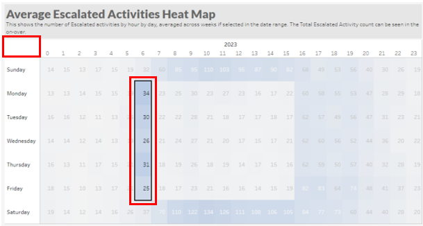
The bottom-left section shows the Average Escalated Activities Heat Map. This shows the Average number of Escalated Activities by hour by day. On the top right corner there is a "Heatmap Parameter" where you can change it to reflect the Total Escalated Activities instead of the Average. All tiles will update to reflect the specific data for the time period of the box (or boxes) selected on the Heat Map. Also works if row or column is selected.
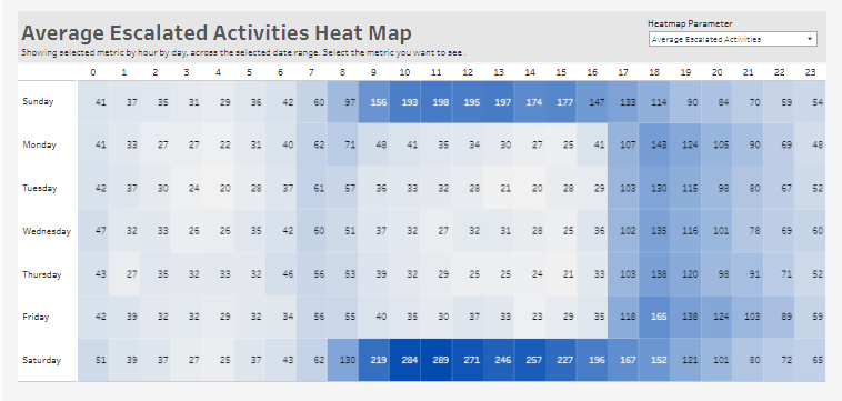
- The Heatmap Parameter shows:
- Average Escalated Activities - The Average number of Escalated Activities by hour by day. The counts in each cell are averaged across the number of that day of week selected in the time range. For example, if the dates selected are August 13-27, which includes 3 Sundays, and I want to know how many activities are escalated on average at 10 am, then the count of escalated activities at 10 am for each of those 3 Sundays (the 13th, the 20th, and 27th) are summed together and then divided by 3.
- Total Escalated Activities - The Total number of Escalated Activities by hour by day. The counts in each cell are summed up across the number of that day of week selected in the time range. For example. if the dates selected are August 13-27, which includes 3 Sundays, and I want to know the total of activities were escalated at 10 am, then the count of escalated activities at 10 am for each of those 3 Sundays (the 13th, the 20th, and the 27th) are summed together.
- The on-hover includes the following information:
- Day of week - This is the day of week related to the cell the user is hovering over.
- Hour - This is the hour of day in military time.
- Avg. Escalated Activities per Week - This is the average number of escalated activities per week; it will match what shows in the cell.
- Total Escalated Activities # - This is the total number of escalated activities for that day and hour over the selected time period.
- Total Activity # - This is the total of all the activities summed up.
- Avg. Escalation Attempts per Week - This is the average number of escalation attempts per week.
- Total Escalation Attempt # - This is the total of all escalation attempts summed up.
The bottom-right section shows the Top 10 Escalated Activities Call Codes. This tile shows the top 10 Call Codes for escalated activities in the selected time frame.
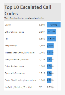
- The call codes shown in this list are only the top 10 used for activities that were escalated and do not represent all call codes for activities within this time period.
- The count shown on each row is the Count of Escalated Activities with the relevant call code.
- The percentage shown on each row is the percentage of Escalated Activities with that call code across all escalated activities and is not limited to a percentage of just the top 10 shown.
- Note: When clicking on a single cell or selecting multiple cells in the heat map, the top 10 call codes will change to reflect the call codes relevant to the activities in the selection instead of the overall total. This allows users to drill down to answer questions like 'What are the reasons for the escalations happening at 8 am Monday through Friday?'.
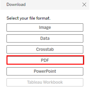
How to Download
- Download whole dashboard as a PDF
- Click "Download", then select "PDF"
- Download a list of Activity IDs that make up a particular number (the first 4 tiles across the top of the dashboard)
- Click on the tile
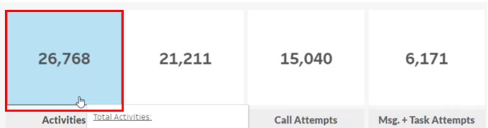
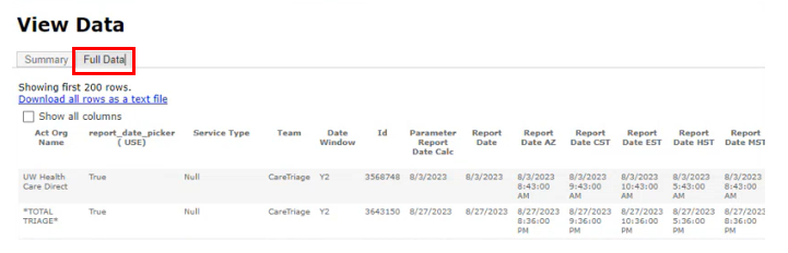
- Click “Download”, then “Full Data”

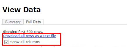
- Click download all rows as text file
- Note: “Show all columns” will download all columns in the underlying table, including some notes columns that may contain PHI.

- Download a list of Contact IDs that make up one of the Call numbers (last two tiles across the top of the dashboard)
- Click on the tile

- Click “Download”, then “Data”
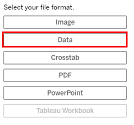
- Click “Full data”

- Click “Download all rows as text file”
- Note: “Show all columns” will download all columns in the underlying table of data similar to the Contact Detail report with additional columns to show the ASA and other relevant values.
- Note: “Show all columns” will download all columns in the underlying table of data similar to the Contact Detail report with additional columns to show the ASA and other relevant values.

- Download the Heat map to download the underlying data (includes Activity IDs and Notes)
- Click on the Heat map
- Select the desired data to download if looking only for a selection. If all data is desired, click on the top left corner of the heat map that is a blank square
- Click “Download”, then “Data”

- Click “Full data”
- Click “Download all rows as text file”
- Note: Show all columns will download all columns in the underlying table, including some notes columns that may contain PHI.

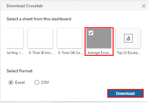
- To download as an excel version of the heat map shown
- Click on the heat map
- Click on “Download”, then “Crosstab”
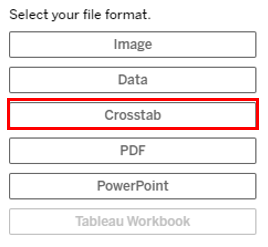
- Click on the Heat Map sheet
- Choose “Excel” or “CSV”
- Click “Download”
- The downloaded file will show by day by hour the following information:
- Avg Escalated Activities
- Count of Escalated Activities
- Count of Escalation Attempts
- Percent of Call escalation attempts
- Percent of message escalation attempts
- Percent of task escalation attempts
- Download the Top 10 Call Codes - Underlying data table
- Click on the tile
- For all data, highlight all call codes

-
- For just the activities for a particular call code select only that call code

- Click “Download”, then “Data”

- Click “Full data”

- Click “Download all rows as text file”
- Note: “Show all columns” will download all columns in the underlying table of data similar to the Contact Detail report with additional columns to show the ASA and other relevant values.