Insights shares data collected from the telephony system and mobile application and statistics gathered from the CareXM clinical service. The dashboard displays the "Call Volume" report, "Average Speed of Answer (ASA)", "Top Call Codes", "Average Handle Time", and "Percentage of Calls Answered by Source System" reports all on one screen.
To access Insights, go to https://insights.carexm.com
You will use the same login information that you use to access CXM to log into Insights. This means that if you change your CXM password, it will update in Insights as well.
Your CXM user must have the Analytics toggle turned ON in order to log into Insights.
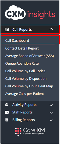
Once logged in, you will be on the landing page and can choose from the different reports by hovering over the category in the left side bar:

Choose "Call Reports", then "Call Dashboard":
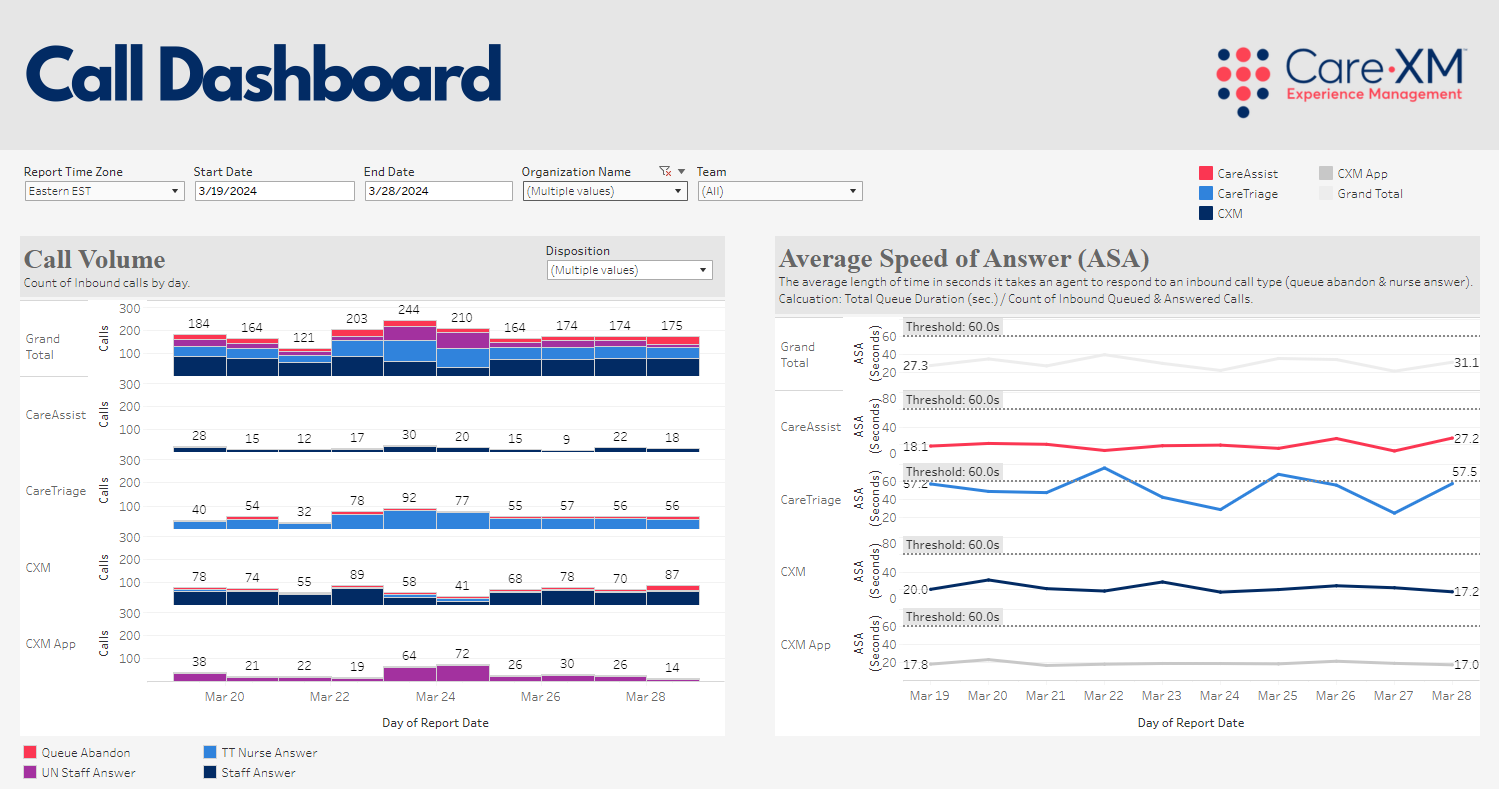

Report Filters:

- Report Time Zone - Defaults to time zone of the organization selected. Allows user to choose time zone to view data.
- Start Date & End Date - Choose date range. The default start and end dates display the previous 10 days. Change the dates to display a specific time period.
- Organization - Choose organization(s) to view in the dashboard. Defaults to all, user will only see organizations they have access to.
- Team -
- CareAssist - Calls taken by CareXM Non-Clinical team (Patient Care Advocates).
- CareTriage - Calls taken by CareXM Clinical team (Registered Nurses).
- CXM App - Calls taken in the Legacy CXM App (Total Triage).
- CXM - Calls taken by Enterprise client users.
- Note: User will only see Teams used by organizations they have access to. Each team has their own color representing their data.
Note: For report to filter correctly, click on the "Apply" button on the bottom of each filter's drop down. Only applies if the list exceeds 10 options.

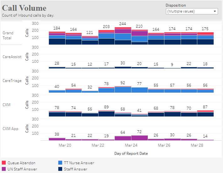
Call Volume -This tile shows the call volume as a bar graph broken out by volume received by each Team (CareAssist, CareTriage, CXM, CXM App, and Grand Total). The Call Dispositions shown in the tile include: Queue Abandon, TT Nurse Answer, UN Staff Answer, and Staff Answer. On the top right corner of the tile you can choose a Disposition so the data can adjust and show the relevant Call Dispositions to the Organization(s) selected in the filters.
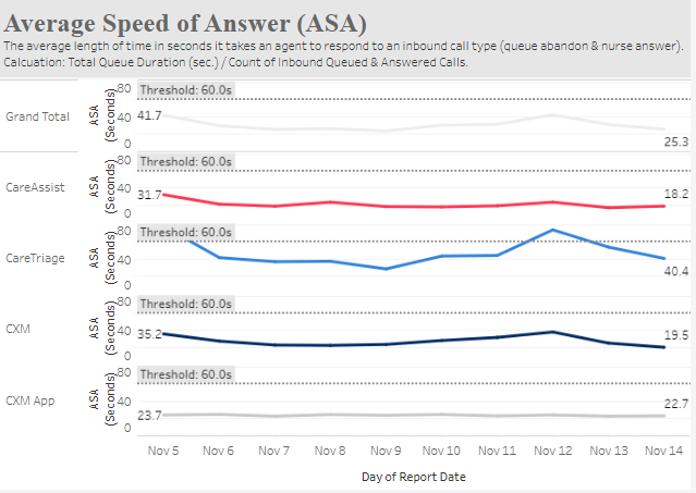
Average Speed of Answer (ASA) - This tile shows the average length of time in seconds it takes an agent to respond to an inbound call. Total Queue Duration (seconds)/ Count of Inbound calls. This tile shows one line
for each team that answered calls. The lines that show are those relevant to the Organization(s) selected in the
filters. Each team Includes Queue Abandon calls, but not IVR Abandon calls.
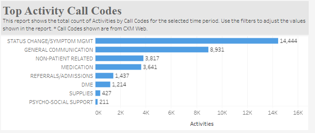
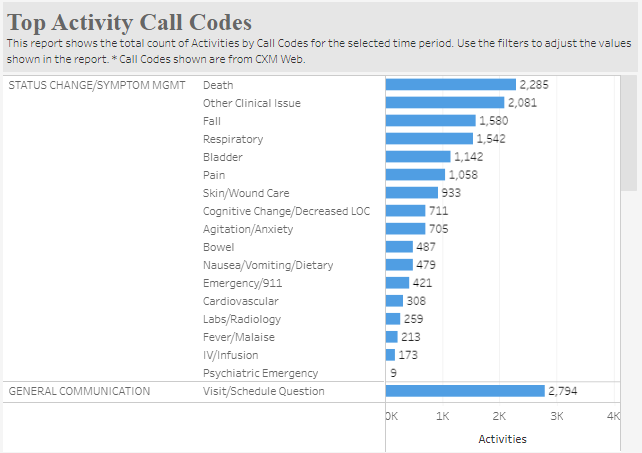
Top Activity Call Codes - This tile shows the total count of Activities for each Call Code and Category in the selected time frame. Hover over the category names there is a small +/- button that allows the user to expand or collapse the categories to show just the Category list or expand to see the count of individual call codes. The list is ranked by the category and then call code with the highest number of Activities. This tile also filters down to show only the call codes for Activities created by the Team(s) selected in the Team filter.
Note: This tile represents the call codes selected when creating an activity and do not represent the counts for Call Codes chosen on the Total Triage Mobile app calls.
Expanded category using the +/- button in each category:
Average Handle Time (AHT) - This tile shows the billable Average Handle time in decimal minutes. Average Handle time is the average time it takes for a nurse or agent to handle an answered call. AHT = (Talk Time + Call Wrap-Up time) / Number of Calls Handled. This tile shows one line for each team that answered calls. The lines that show are those relevant to the Organization(s) selected in the filters.

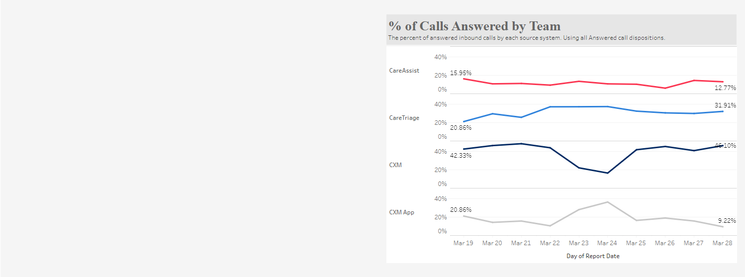
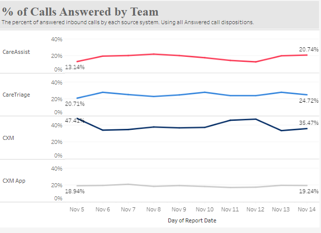
Percentage (%) of Calls Answered by Team - This tile shows the percent of inbound calls answered by each Team.
- Day/week/month button on other tiles - Call Volume, ASA, AHT, and % of Calls Answered by Source System tiles have a +/- button on the bottom left corner that appears when the user hovers over the x or y axis of the visualization. When clicked, these buttons allow the user to change the visualization to show totals from day to week, week to month, month to quarter. Adjustments to this will stay within the time period the user has selected.
Related Articles